My original idea was to create a logo that represented a ‘Peace’, per say, between console and PC gamers because we are all in the same. I started my drawing off with a controller to represent console gamers then drew a mouse to represent PC gamers. I then decided to add a banner at the top with the words “One Love” for our shared love of games.

When I began my rough design, I started with the controller since I knew it would take the longest to create! After well over an hour, and using this image as a base (image below), I finally finished the design. Many of the features such as the ‘figure 8’ looking parts holding buttons and the joysticks took me the longest to figure out how to make. After 20 minutes of messing with tools, I finally came up with an actual working ‘figure 8’. The buttons were easy to create because they are just circles or squares! Same with the joysticks. My final rough product turned out fantastic in my eyes!

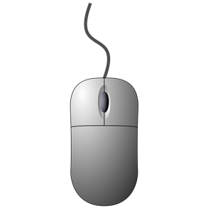
As for the mouse, it was very simple once I figured out how most of the tools work. I used this image as a base (image below).
And finally, My final product. I’m very excited about how this turned out because it was just as I imagined it. I know I can use a little work on the color aspect, but for a rough design, this one is a keeper.

Some things I will work on to help aid this into the final draft phase is adding color and lighting, as well as maybe shifting the sizes of a couple objects. Also, maybe make a background and add labels to the buttons!

Your logo is crazy good. It looks professional!!! I applaud your time commitment to this project; you mentioned how you had to spend time learning how to create the shapes and I think it’s really cool that you actually put effort into this project to do so. I think your design has the most strength in the preciseness of your logo. The controller looks exactly like a controller and the mouse looks exactly like a mouse. I think that once you add color, this logo could literally pass for a logo that an actually company would use. I also really like the text that you chose! I think that you could improve your logo by making the scroll part of the mouse (the long, solid black oval) not a solid element. I think if this element was a just outlined in black with a white fill (like the elements on the controller), it would create an even more cohesive design. Right now, my eyes just seem to be drawn to it because it is solid black, and it distracts a little bit from the controller. I also think that you could improve your logo by adding color, but I know that is already part of your plans! Your logo is really really good; I’m happy I got to be in this group to see it!
LikeLike
I really like the idea of your project! It was well thought out and executed good as well. The way that you connected your ideas was a really cool idea and I like the logo overall. A few things that could be changed it that it is lacking in color a little bit, unless that is what you are going for. I would probably add some color in the buttons and other things in the controller to make it pop a bit more to people who are looking at it.
LikeLike
I think your draft logo is super good! You mentioned that you spent a lot of time messing with Adobe Illustrators tools and creating the image you had in mind, and your commitment to the project definitely shows. Your logo is very detailed, and accurately depicts a gaming controller and computer mouse. I think the overall design, and execution of your logo is the greatest strength of this project. One aspect I think you could change would be including some color. The black and white is very plain, and not very eye-catching. I think by adding some basic color to your design, it will stand out a lot more and look even more professional. Another small aspect I think you could change would be the size/thickness of the font. The text adds an interesting aspect to the design, but I think the boldness of it takes away from the image you spent a lot of time creating. Other than those two things, I think your design is really great!
LikeLike
I love your logo! I can tell you worked very hard on it and it took a long time to do. The lines all look super clean and the font fits the video game theme very well. I love how the controller looks as if its plugged into the text. The only suggestion I have it to make sure the details will work if the logo was a smaller size, like for a smartphone app. I think the logo right now is perfect in a bigger size but just make sure it will work smaller! Also, some color might look cool, but the monotone looks also works with it. Overall super good job, your logo is already almost perfect.
LikeLike