My final design for my logo turned out greater than how I first imagined. From my sketch, to my rough draft, and finally to my final product, many changes and improvements came to be. My original idea stayed true to itself and to my topic while utilizing all the tools I learned from the original Illustrator tutorials as well as some tools I figured out myself along the way. After many hours put into this design, here is my final product:

My original Idea started off on the physical sketch. After much thinking of how I could incorporate a logo into my topic, I came to the conclusion of bringing the gaming groups together. As you may already know, gaming is split between console and PC. Each group believes they are better than the other. So my design was to bring them together. I decided to draw a controller for console gamers and a mouse for PC gamers, and also added a banner at the top reading “One Love” representing how we could come together under our love for gaming.

When I began my rough design, I started with the controller since I knew it would take the longest to create! After well over an hour, and using this image as a base (image below), I finally finished the design. Many of the features such as the ‘figure 8’ looking parts holding buttons and the joysticks took me the longest to figure out how to make. After 20 minutes of messing with tools, I finally came up with an actual working ‘figure 8’. The buttons were easy to create because they are just circles or squares! Same with the joysticks. My final rough product turned out fantastic in my eyes!

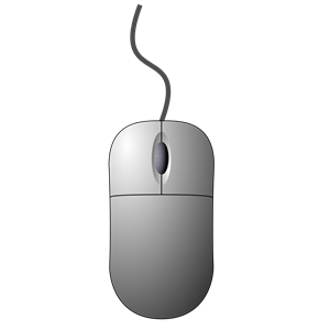
As for the mouse, it was very simple once I figured out how most of the tools work. I used this image as a base (image below).
My rough draft logo design was finally complete after adding the banner. When I finished, I realized that my scaling was off on many of my controller parts so I made some quick adjustments there. Here is my final rough draft logo design:

When it came time to start my final design, I knew I had to add color. Since I had spent so much time originally on my rough design, I was too tired to add color by the end of it. This was prominent as well when my peers reviewed it and criticized it in this way. Also, another thing that came up was the fact that the scroll wheel on the mouse brought a lot of attention away from other parts of the design, so I went on fixing that too.
After adding color to my design, there was a lot of empty white space, so I decided to add a background to the controller and mouse, trying to stay away from bright colors which would draw too much attention to it. Finally, I went onto adding gradients to parts of the design that I felt would have been hit by a light source. This took a decent amount of time because I had to add the different colors to the gradient that wouldn’t alter the original look of the design. After many color and angle changes to the gradient, I came to my final design. Here it is again:

I am very proud of this design and how I may use these tools in the future. I have already been able to use this knowledge to help create an app for my team at the Hackathon!


